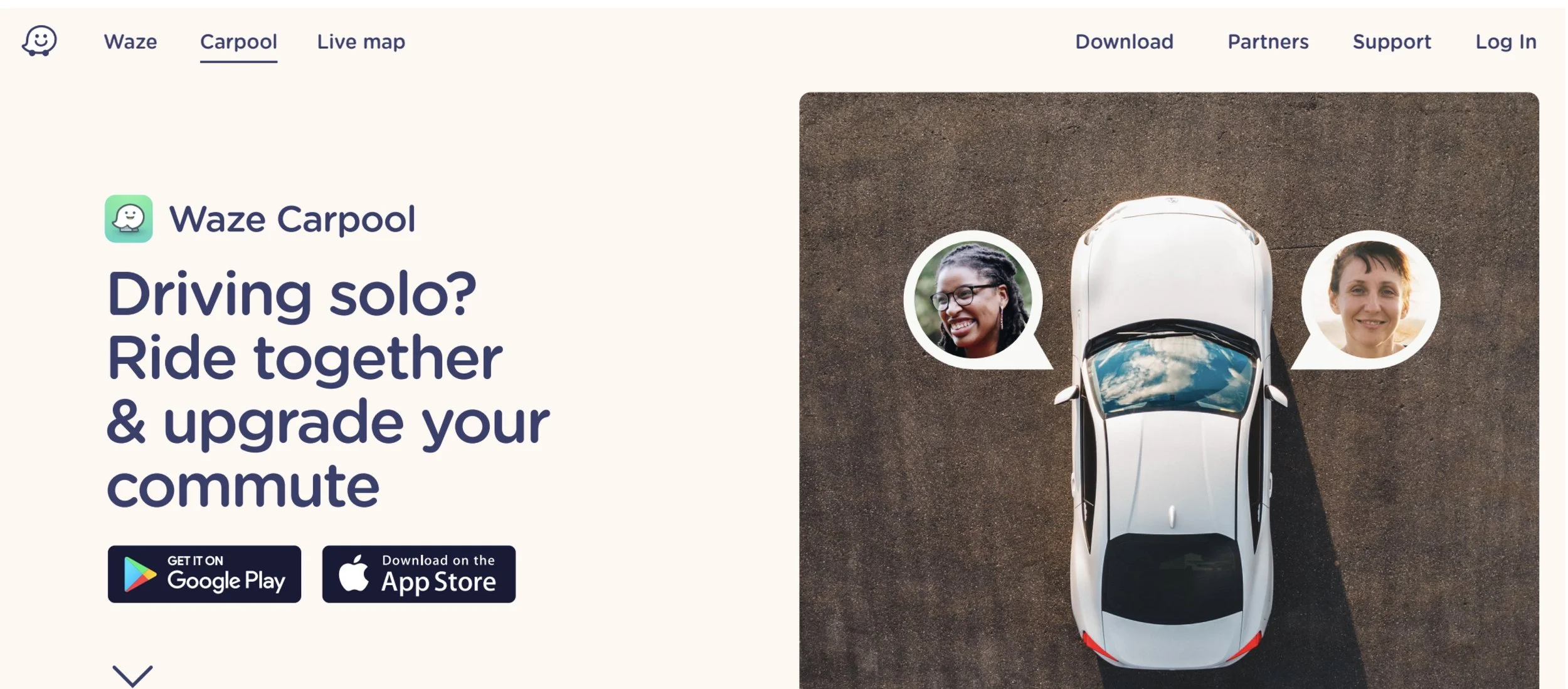
Waze Carpool
Client: Waze, 2019
Role: UX Researcher (Freelance)
Medium: Web/App
Primary users: All-ages, drivers (US)
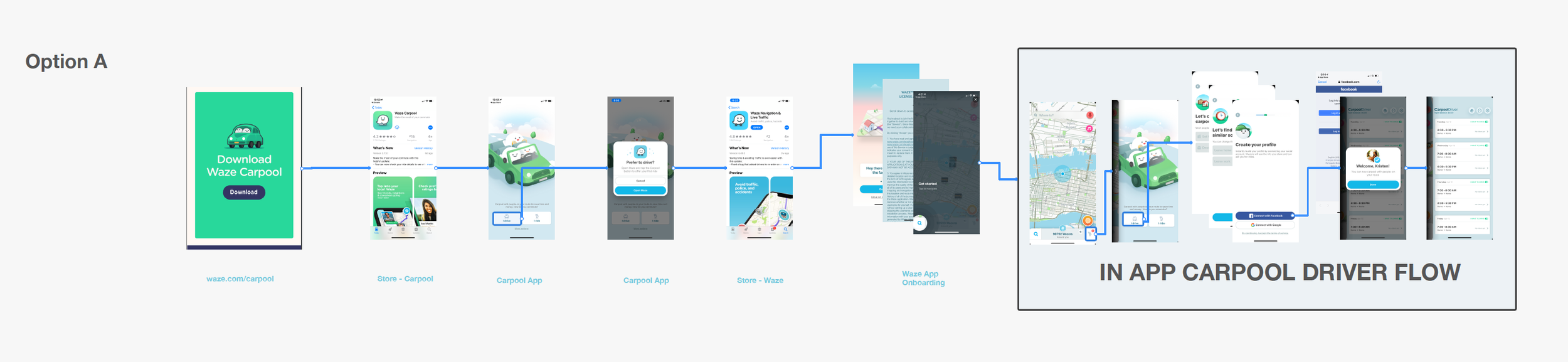
Waze.com launched a new reskin of the website with the intent of streamlining the experience so users can clearly differentiate between Waze and Waze Carpool. There were two design directions for the Waze Carpool download flow and the team wanted to find out which design was most clear in explaining the two products.
Process
I worked closely with the lead product strategist and project manager to test 24 people on usertesting.com. We recruited participants through Usertesting.com and split the groups into two to walk through two different flows starting with a different marketing page design.

Outcomes
The results of the test uncovered some gaps within the app experience that marketing website could not solve. The Waze team took the insights and added them to the app roadmap to fix iconongraphy, button placement, and messaging copy within app and marketing website.
As of September 2022, the app was shut down due to shifting commuting patterns as a result of the pandemic.
